⚠️ This article was written in and last updated in so may contain some out of date information.
The Problem
Have you ever noticed what seems like a margin beneath an image that you can't get rid of?
<div style="background-color: red; margin: 0; padding: 0;">
    <img style="margin: 0; padding: 0;" src="/media/t5jphaup/favicon.png" />
    Abc Xyz
</div>
Renders as:
See that red strip at the bottom? It shouldn't be there, right? I explicitly stated I didn't want a margin or any padding on both elements!
Well, after some research, the culprit is line-height.
Everything has a line-height. On most elements, however, its normally the same height or smaller than the element you want to display. In this case, the image is bigger than the line height (around 1.5em in most browsers, and the font on this webpage is probably 12px so is line-height can be approximated to be 18px (12 * 1.5 = 18)) and yet the line height is still having an effect. I can prove it is the line-height by doing this:
<div style="background-color: red; line-height: 0;">
    <img src="/media/t5jphaup/favicon.png" />
    Abc Xyz
</div>
Renders as:
See? No red line!
However, what if I wanted to render a string after the element? Making line-height: 0px is not ideal - not to mention how horribly hacky it is. This was the solution I saw posted on numerous forums. But I thought there must be another way... why is the image being rendered half way up the "line"?
That's when it hit me!
Images have vertical-align: baseline as their default - of course!
Time for a Calligraphy Lesson!
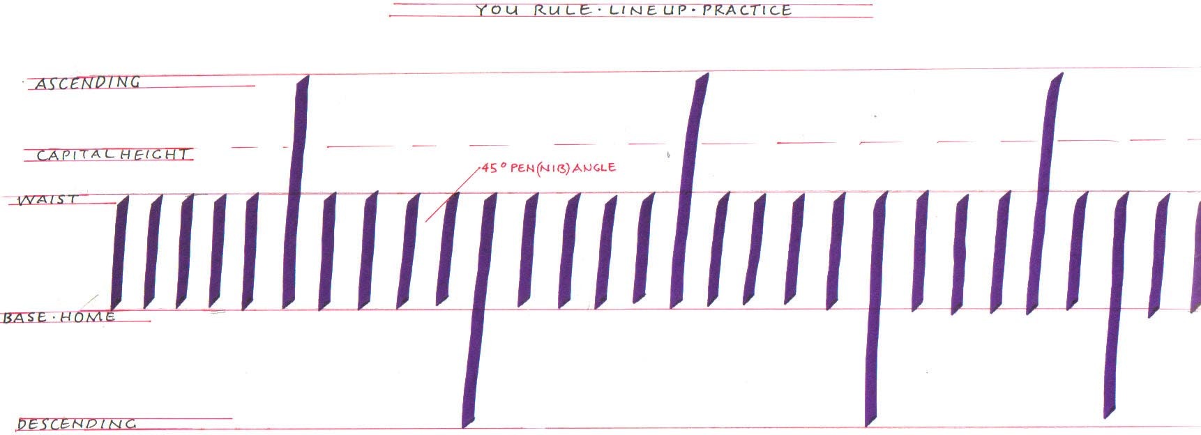
The base line is the line that most letters sit on (a, b, c, d, e). There are letters that sit below this line (g, j, p, q, y). These letters touch the descending line. Above the base line, there are various other lines but we don't care about them right now, but the top one is the ascending line.

Image from Calligraphy for Beginners (Archive.org link). Seems like a good website if you want to know more!
The line-height in HTML defaults to the distance between the ascending and descending lines. The image, however, is sitting on the base line. So, this red line is the distance between the base line and the descending line!
Fixing the issue
Using the following CSS fixes my little issue and is more useful in most circumstances.
img {
    vertical-align: bottom;
}
So, when used in the example:
<div style="background-color: red;">
    <img style="vertical-align: bottom;" src="/media/t5jphaup/favicon.png" />
    Abc Xyz
</div>
Renders as: