⚠️ This article was written in and contains out of date information.
⚠️ In v14 this functionality was extremely limited. This article is here for posterity and only applies to v14.1 and close versions.
See my Umbraco AngularJS filter cheat sheet for v13 and below.
I'm working on a modern UFM cheat sheet for v17+.
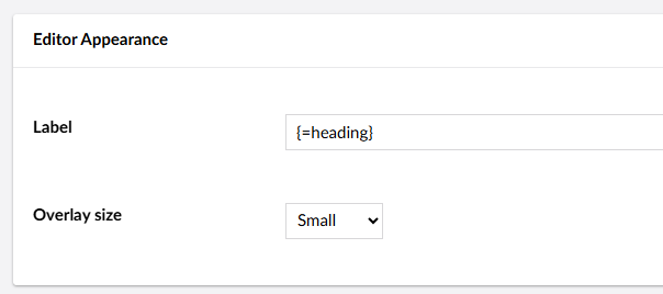
When you're configuring a block type in a block list or block grid, you're provided with a "Label" field. Similarly, custom columns in your list views have a "label template". You can just type some plain text in here, but using dynamic labels is where it really shines.
Text string properties
If your content item has a field with the alias heading, to render this in UFM we simply type {=heading}. This might render as:
Contact us
You can also wrap this with other content such as Text block: {=heading} to render
Text block: Contact us
This syntax works the same for text box, text area, email, decimal (non-zero values only), numeric (non-zero values only) but not rich text editor, slider, etc.
⚠️ Before v14.2, if the field is empty the alias of the property is returned in curly braces. So, {=heading} with no value becomes {heading}
Markdown and HTML
Since UFM is Markdown, we are able to use Markdown syntax or HTML as well.
For example, **{=heading}** - {=subheading} would render
Contact us - How to get in touch
Or, using HTML, **Quote:** <q>{=quote}</q> - {=attribution}. Might render you:
Quote:
Joe, you're actually quite funny sometimes- Lotte Pitcher
Toggles (true/false or boolean)
These fields will spit out a "true" or "false". Or, if left as default, will be blank.
So, {=heading} (Disabled: {=disabled}) may become:
My block heading (Disabled: true)
My block heading (Disabled: false)
Or if left unset:
My block heading (Disabled: )
Content pickers
Not supported in 14.1, but a work-in-progress exists.
Writing your own
Much like in AngularJS, it's possible to write your own UFM components. Components follow the same pattern as the default, but the = is replaced with a custom symbol.
In this example, I use the symbol %, so {% Hello} would render as:
👋🏻 Hello!
First, I created a package manifest at ~/App_Plugins/umf-customisations/umbraco-package.json, and set my marker to %:
{
  "id": "UFM Customisations",
  "name": "Joe Glombek",
  "version": "1.0.0",
  "allowPackageTelemetry": true,
  "extensions": [
    {
      "type": "ufmComponent",
      "alias": "My.CustomComponent",
      "name": "My Custom UFM Component",
      "api": "/App_Plugins/ufm-customisations/components/my-custom.component.js",
      "meta": {
        "marker": "%"
      }
    }
  ]
}
Then, in the referenced ~/App_Plugins/ufm-customisations/components/my-custom.component.js:
export default class MyCustomComponent {
  render(token) {
    return `👋🏻 ${token.text}!`;
  }
}
For more complex scenarios, you'd likely want to use Typescript and implement UfmComponentBase:
export class MyCustomComponent implements UfmComponentBase {
    render(token: Tokens.Generic) {
        // Do something more clever here
    }
}
and make use of the @umbraco-cms/backoffice NPM package.
The return value can also be a web component, like the default {=name} component:
return `<ufm-label-value alias="${token.text}"></ufm-label-value>`;
Allowing for all complex logic to sit inside a separate web component.
A better example will follow, once I have one.
Bugs and quirks
The following have been raised on the Umbraco issue tracker, but are worth noting.
In a collection view, the value outputted by theAs of v14.2, in collection views the syntax is now always{=x}syntax always outputs the value of the field selected{=value}, much like the Angular formatNull fields (or fields with a default value of null) render the name of the label, with no option to coalesce to something elseThis has a fix in v14.2, but I haven't tested it yetNull-like values will not render (e.g. aAs of v14.2, falsey values render correctly0in a numeric field)I could not get localization (This was a typo but requires further testing for custom dictionary items{#general_chose}) to work in the dynamic labels